How Colors In Interiors Affect Your Psychology? : An Exploration!
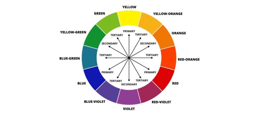
Exploring the ” how colors in interiors affect your psychology” can be a fascinating topic. Before understanding the importance of choosing right colors, it is important to understand the standard color wheel. A color wheel is primarily a standard circular wheel which shows a relation between the colors and how these colors compliment each other.
Let’s understand the two types of colors-
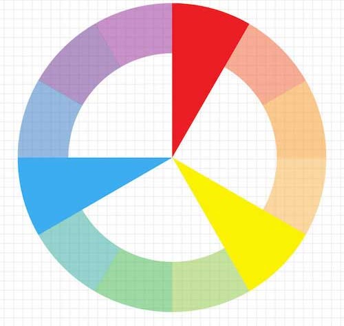
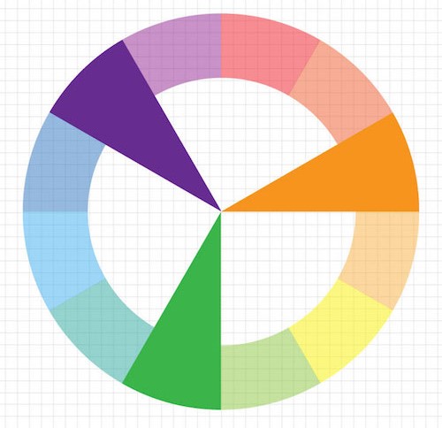
Warm Color– The reds, oranges and yellows are the warm colors. These colors comparatively have a higher temperature than the cool colors. Warm colors evoke a sense of energy, appetite and positivity. When you see any of these colors your mind usually keeps on wandering and increases your energy.
Cool Color– The blues, greens and magentas are the cool colors. These colors tends to have lower temperature and provides a sense of peace, calm and relaxation.
Types of color in a color wheel-
Primary colors– There are 3 primary colors in a color wheel – red, yellow and blue.
Secondary Colors– Secondary colors are created by mixing 2 primary colors.
Red + Blue = Violet
Red + Yellow = Orange
Blue + Yellow = Green
Tertiary Colors – Mixing a primary color and a secondary color creates tertiary color.
Blue (Primary) + Violet (Secondary) = Blue- Violet
Red (Primary) + Violet (Secondary) = Red- Violet
Red (Primary) + Orange (Secondary) = Red- Orange
Yellow (Primary) + Orange (Secondary) = Yellow- Orange
Yellow (Primary) + Green (Secondary) = Yellow- Green
Blue (Primary) + Green (Secondary) = Blue- Green

Light vs Dark colors
Light colors – Light colors reflect the light incident on the surface and make the space look bigger, breathable and lighter. They often make the space look cleaner and at peace.
Dark colors – Dark colors absorb the light and barely reflect it striking on the surface. It makes the space look warmer, cozier and intimate. However, excessive use of these colors can affect the space and make it seem smaller and not breathable enough.
Considering Cultural Notions
The meaning of colors can vary according to different cultures. For eg- White may symbolize purity and peace in Western culture whereas it depicts mourning in some Eastern cultures. As a result, it is important to use colors in interiors according to us according to our own culture and noone should be judged on the basis of the colors they use as it may have a different meaning in their culture.
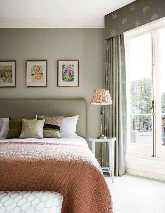
Choosing the right textile colors is as important as choosing the colors for different elements in your interiors. A small change in your textile colors may have a huge impact on the interiors and your psychology. Here’s a small guide on how-to-choose the right colors for your textiles and various other elements-
- Firstly, it is important to understand the functionality of the space. Is it a comfy and relaxing bedroom, an energizing office, or a vibrant living room. The colors chosen according to the purpose of the room are the best colors chosen for your space. For eg– If it is an office, someone might need enough open space and a peaceful area to help them in bringing ideas. Light colors or cool colors will definitely help them to make their office much more breathable and liveable. An accent in your textiles can help in making your space exciting yet liveable. You can add an accent color like greens or reds or some other colors.
- Understanding color wheel and the psychology behind it. We studied the color wheel above, what are primary, secondary, tertiary colors and then what are warm and cool colors. But how the usage of these colors affect our psychology? Warm colors like red, yellow and orange can be exciting, can increase appetite, can be invigorating, whereas cool colors like blue, green and violet promote calmness and peace.
- Lighting conditions. Every space has different lighting conditions. Different textiles look different under different lighting conditions. It is important to go for textiles that look appropriate to the lighting of your space.
- Being practical. Keeping the aesthetics in mind it is important for being practical for your space. In case of heavy traffic areas, it is advisable to go for textiles that are easy to clean and maintain. Aesthetics is the secondary choice, the first preference should always be functionality.
- Patterns and prints. Solids is the safest thing that everyone can go for. But going for patterns and prints is a bold step and should always be taken after knowing your space well. Going for prints and patterns clashing with your walls or other areas in your space should always be avoided. A good knowledge of your entire space can help you in choosing the right prints and patterns for your space.
- Color Intensity. Going for neutrals is the best step with having no-knowledge of colors. Bright colors makes a more bolder statement. A good mix of warm and cool colors makes a space both liveable at peace and cozy yet comfy. But using too many bright colors can be too daunting. Conversely, using monochromatic colors for your entire space can be a good choice.
- Personality is the key. At the end of the day, it’s you who’d living in that space and making the most out of it. Your space should be a reflection of who you are and not what someone else says. If there’s a personal preference of a color then you should definitely go for it and find ways to incorporate it in your space.
- Seasonal freak. If you’re a kind of person who loves changing their interiors with different seasons. Then, using neutrals or monochromatic colors with an accent or pop-up color can be a good choice as it is easy to change with seasons.

Follow us on instagram : Plum House